

A client once asked us to add, in their words, a HubSpot tracking code so they could see what their users were doing in the app.
They thought adding that code to the page would somehow enable them to see all user activity logged to HubSpot. It wouldn’t. That level of tracking takes quite a bit of effort, and it starts with deciding exactly what you want to know.
So we asked. They only wanted to know when people logged in. Admins wanted the login date and time so they could make better renewal decisions and know which clients to follow up with as renewals neared.
That turned out to be a small change to the login form. They got what they wanted without a whole new initiative.
The request was “tracking.” The need was knowing who to call before renewal.
That’s the kind of question to ask of everything on your list once your software goes live. When you’re improving software after launch, every request gets measured against two things: what the tool is meant to achieve, and how many of the people using it the change would help.
Name the needle you’re trying to move
Start by getting clear on what your tool is for and what it’s meant to achieve.
For 4MyCiTy, the needle was how quickly they could check people in. They had a line that kept growing as people waited to check in and pick up vegetables. They wanted that line to get shorter over time while the number of people they served went up.
So they watched two things. The number of people served in a day, which they wanted to go up. And the time to check in, or more simply, the length of the line throughout the day, which they wanted to go down.
People served per day was the key thing, and the easiest to track. The line was a little bit of a gut feel, but it was easy to see. The number of people was increasing, and the line wasn’t growing with it. They could also see, in their lived experience, that each check-in was going much faster than keying people into a spreadsheet.
It didn’t require a lot of metrics to figure that out.
High usage isn’t the same as high value
Once you know what you’re trying to achieve, how people actually use the tool tells you whether you’re getting it. I’d want to trust that more than gut feel, comments, or review quotes. You’ve got to make sure your metrics actually track the needle you’re trying to move.
Be careful with volume, though. For a lot of tools, especially ones that help people get their job done, low usage can be a good sign. The tool helps people finish their work quickly, and they move on to something else. At 4MyCiTy, less time per check-in was the whole point.
So look past the volume. Are people getting tasks done in the app faster? Or are they using it less? If they’re using it less and the job isn’t getting done, that’s not good.
Then ask how many people it helps
If a request does move the needle, ask how many people, or what share of your audience, it does that for. A change that only reaches a small slice of your users might wait.
One client asked to show a QR code on each student assessment the app generates. Today the app creates a link that gets copied and pasted onto another device. A QR code that could be scanned to open the assessment might be easier.
It’s in the backlog. Not because it’s a bad idea, but because it isn’t moving any specific needle in a meaningful way, and it comes from a relatively small audience.
The exception is when that small group matters more than its size. Maybe they’re a core constituency, or someone who pays a lot. That’s a business decision.
The login change mentioned earlier was one of those exceptions. That app has thousands of users across our client’s customers and internal employees, and the login details only matter to a handful of them. But knowing who to call before renewal has a real impact on their business, so it made sense to do it.
Make “not yet” visible
Most leaders don’t have a scope agreement to point to when they tell their own staff or board “not yet.” What you can show them is impact and effort.
Plot every request on a simple four-square grid, with impact on one axis and effort on the other. The ones with the biggest impact for the lowest effort are the ones you do first. The ones with the lowest impact for the highest effort, you probably don’t do at all.
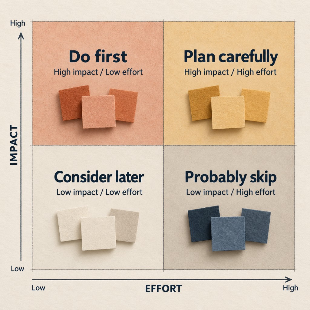
When stakeholders can see the whole list laid out that way, it’s an easier case to make for why you are or aren’t doing something right now.
With our Product Stewardship clients, the agreement draws that line, and a new feature goes into the backlog for the next phase.
Where to start with your own list
- Name the needle. Write down the result your tool exists to produce, and one or two signs you’d see if it’s working.
- Ask what each request is for. Sometimes a vague ask hides a smaller need.
- Ask how many people it helps, and whether a small group matters enough to go first anyway.
- Plot what’s left by impact and effort, and share the picture.
Requests that wait don’t disappear. On our most involved stewardship plan, a product strategist reviews the product roadmap with the client on a regular schedule, using what we’ve seen during stewardship and what users have been saying.
The next time a request says “tracking,” ask what it’s for. If your request list is growing faster than your software, we can help you sort it.
Related posts

After Launch
Why New Software Goes Unused, and How to Get Your Staff to Actually Use It
Why new software goes unused: staff work around tools that make their jobs harder. Learn how to find the cause and fix it, even if it isn’t new software.

After Launch
Launch Is the Halfway Point: What Happens After Your Software Goes Live
Launch is the first real test, not the finish line. Here's what happens after your software goes live, who owns it, and what to decide before launch day.

Hiring a Software Partner
How 4MyCiTy Went From Manual Check-ins to Real-Time Reports
Nonprofit mobile app case study: how 4MyCiTy went from manual check-ins and spreadsheets to real-time reports, and why we kept going back to the field.